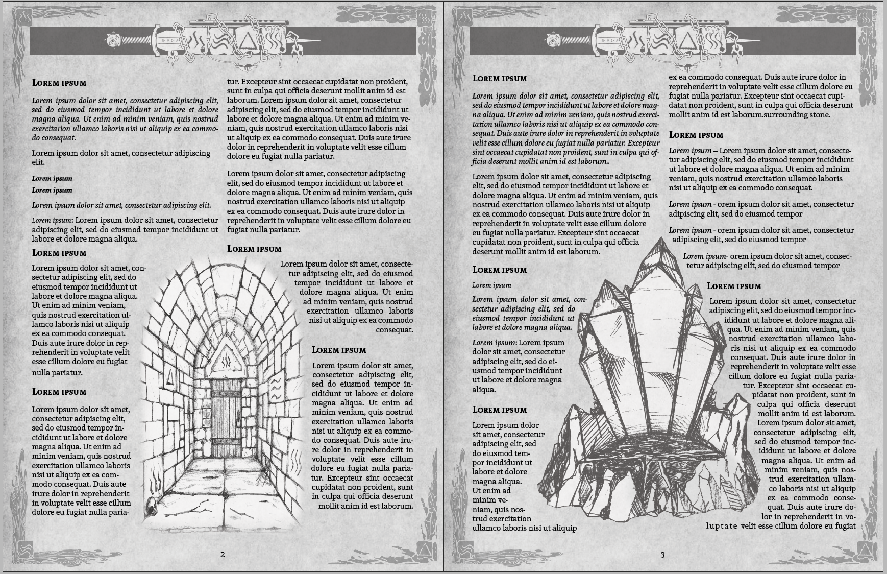
I’m working on the next release for 2 Old Guys Games and I put together some pages as a demonstration of how different this product will be from previous ones in terms of visual layout. This adventure has been rumbling around since before 2OG even was formed. Now, we’ve got the art and the visual aspect all done to go with the text. Adobe just updated Creative Cloud and with it came a cool new text wrapping automation feature which really sped up some processes that can be time consuming. With that, I was able to do some fairly quick, fancy text wrapping that carries through the whole product. Here are some example pages.

Since this product is going to be released for 5e D&D and Dungeon Crawl Classics, we wanted a cohesive, but retro feel to it. The page texture and black and white graphics help achieve that. There’s a particular theme to the dungeon as well and so that is represented in numerous elements in the design. This brought the product together really well. The art for page decoration and graphics, as well as the maps, all came from my old friend, Warklaw. Since I’m somewhat graphically challenged, as I put it, we always need to source art and since he worked with us on Sinking the Stercorarius we decided o do it again.
Combined, we all make a great team and are able to give solid, success-building feedback on things. I’m just so pleased with this layout and overall aesthetic, I thought it deserved its own post.
When the product drops it will be available on DM’s Guild and DrivethruRPG. You can stay up to date with all the things going on at 2 Old Guys Games on Twitter, our website, or our publisher page on DTRPG.